Wednesday, May 16, 2007
Communications
This is an excellent commercial which focuses on communication, which I learnt in class either people to technology or people to people. Its very funny ad on understanding either through speaking, reading, writing or listening or even through images is very important.
Loud shirt day
 I have been looking for this website since last Friday and I have finally found it, I didn't want to tell anyone that I was looking for it because I didn't want to look like an idiot and thinking that it did exists when really it didn't. I overheard a conversation where my sister was talking on the phone about Loud shirt day and I thought yeh it might be true inwhich She made me wear a loud shirt on Friday 11 May 2007, I won't even tell you what colour I wore. I hope you guys wore shirts that really stood out too on the day. I wanted to know a little more about this Charity and I found it on loudshirtday.com.au Its a fundraising activity to raise money for great kids and we are talking about deaf kids. This is the first time I have ever hear a charity award and it was quite exciting, unfortunately my work colleagues didn't know about it and it would have been good to have everyone at work wear something loud and proud, plus it might brighten the place up to. I would love to have a link to this website form my own and help support the kids out there. They are the future and by help raising funds for their education, lifestyle and career opportunities it would make this world a brighter place...and on the website.
If I had to redesign their website I would make it more appealing in term of colour and design. The user capabilities has an easy flow and quite clear. The navigation level is on the left hand side of the screen with main copy on the right hand side. Major things I would change are the text size; there is too much text sizing for the eye and some images are quite small and need some more quirky or fun images of.
So Happy LOUD Shirt day to all those kids out there
Friday, May 11, 2007
Changes
If you guys are wondering if I have read this blog, well maybe you have but the design layout keeps chaning, I get bored very quickly with my design template. I prefer to change colours form time to time, just like when you wake and you want to know what to wear today. SOmetimes I foget if today is saturday or sunday...anyway I came across an excellent design site which provides details about colour, pattern, products and also information about other designers. This really helped me to put a design concept together.
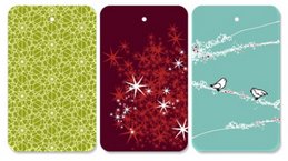
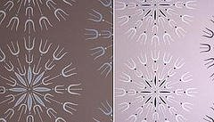
The design on the left handside is from Tord Boontje's which is called Ivy Panel, its a panel for the wall. The second picture of the blossom is a note pad from Binth's

See aplustore
This website provides different products for homeware and personal items but I came across these design which is a reflection and provides ideas for my website. The website capabilities and functions were easy to use from a customers perspective. Its quite boring in term of design but the concept or focal point was the product. I think the website could have some what more colour and re design the layout of the product display. There top navigation is very clean and clear for the viewer, and the navigation list on the left hand side lists a category of products sold which is also a normal design function. I would redesign it so it doesn't look so nutritional or medical looking, the logo is quite boring and also it shows a medical status rather than selling home ware products. This could be there website concept but if I had to redesign the web page where it will still keep the main functional aspects but have it a lot more trendy and vibrant and I would re-engineer the page layout and a way to attract customers to buy the item. I'm not trying to bag out the website its just I would of done it differently.
Homeware product in this generation is a growing trend everybody is buying something for their house, it continually changes all the time. I noticed my mum keeps buying products and designs for our kitchen or the living room. Colours are important and so is design, if you put effort into the website people will think this person really knows what they are talking about in regards whats happening with the world today etc,..(see First Impression count for web). I need to make sure the design layout, colour and so on reflect my target audience; as 5 seconds on a website is so important before the viewer click away.
The design on the left handside is from Tord Boontje's which is called Ivy Panel, its a panel for the wall. The second picture of the blossom is a note pad from Binth's

See aplustore
This website provides different products for homeware and personal items but I came across these design which is a reflection and provides ideas for my website. The website capabilities and functions were easy to use from a customers perspective. Its quite boring in term of design but the concept or focal point was the product. I think the website could have some what more colour and re design the layout of the product display. There top navigation is very clean and clear for the viewer, and the navigation list on the left hand side lists a category of products sold which is also a normal design function. I would redesign it so it doesn't look so nutritional or medical looking, the logo is quite boring and also it shows a medical status rather than selling home ware products. This could be there website concept but if I had to redesign the web page where it will still keep the main functional aspects but have it a lot more trendy and vibrant and I would re-engineer the page layout and a way to attract customers to buy the item. I'm not trying to bag out the website its just I would of done it differently.
Homeware product in this generation is a growing trend everybody is buying something for their house, it continually changes all the time. I noticed my mum keeps buying products and designs for our kitchen or the living room. Colours are important and so is design, if you put effort into the website people will think this person really knows what they are talking about in regards whats happening with the world today etc,..(see First Impression count for web). I need to make sure the design layout, colour and so on reflect my target audience; as 5 seconds on a website is so important before the viewer click away.
Tuesday, May 1, 2007
Design your own dress
This website is similar to the concept on what I am looking at however its not a competition it's for demales who want to design their own dresses for themself not for the whole market place. I think it really suits for those girlie girls out there...so gurls in my class you guys might like this site.
http://www.studio28couture.com/
This site allows the person to be a designer without further cutting and sewing it up. It allows a variety of styles, fabrication and also deisgn. Costs for a dress is approximately $180 which is probably on the expensive range. The colours shown are not very attractive through the whole site plus I think its too messy. Functionality is quite simple, interactive and easy steps to follow for the user but poor design especially the homepage.
Subscribe to:
Posts (Atom)


